Altoida is pioneering precision neurology by building the world's leading platform for reliable, accessible, affordable prognosis and monitoring of neurological diseases. It is an FDA approved augmented reality platform that can detect with 94% accuracy if a person has Mild Cognitive Impairment (MCI) before the onset.
THE PRODUCT
According to research, 12.7 million people age 65+ are projected to have Alzheimer's disease (AD) by 2050 - 1/3 of Americans will have the condition or be directly impacted by it at some point.
The existing medication seems to be helpful only if used in the early stages, and since AD starts developing 20 years before symptoms arise, early detection is imperative.
THE CHALLENGE
Users struggled with the instructions on Altoida’s mobile application tutorial, impacting their test results and app retention rate. Altoida needed to redesign its mobile app tutorial.
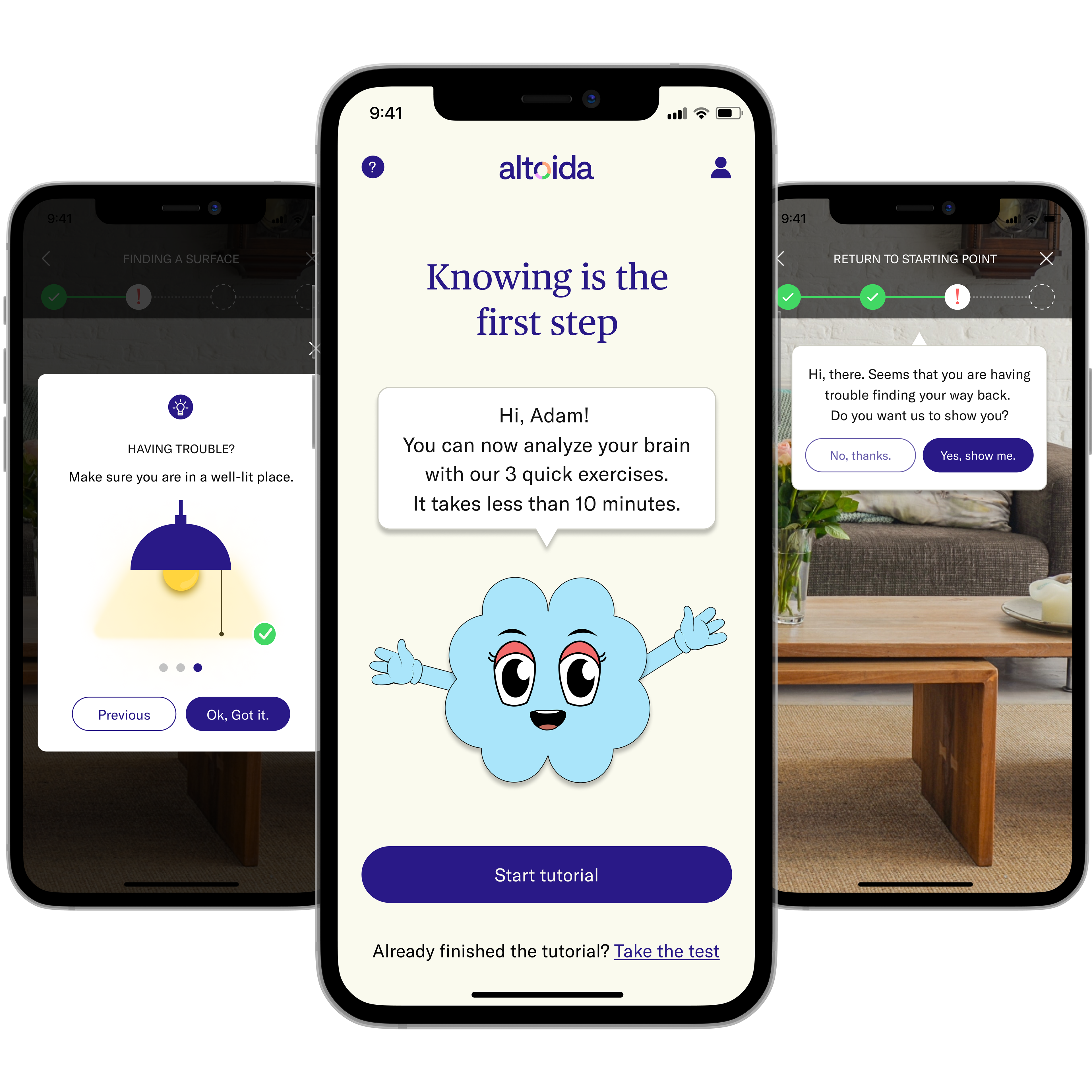
The challenge is to design a tutorial that is clear to follow and engaging to MCIs. Users should go through an experience in under 10 minutes that would also have a friendly tone and be somewhat educational to decrease people's stigma about cognitive diseases.
Persona
...meet: Adam!

Facts
Adam's daughter asked him to take a cognitive test. He is not presenting any AD symptoms, but she wants to confirm he is ok. He is resistant to taking the test because he fears bad news and feels unmotivated since there is no known cure.
Frustrations
He doesn't know much about cognitive testing, and there is a stigma on the word "Alzheimer," so he avoids even thinking about it
There is much information out there and it is hard to keep up
Behaviors & Goals
Adam visits his doctors regularly, but any activity should be compliant with the insurance company or covered by his doctors
He wants to prove his brain is healthy and wants to maintain his independence as he ages
Strategy, ux and ui
After brainstorming, the final tutorial was divided into three sections: Motor activities, augmented reality, and speech & memory. The purpose was to walk Adam through each exercise and ensure he is comfortable with the platform to confidently take the assessment, keeping Altoida's 10-minute target in mind.
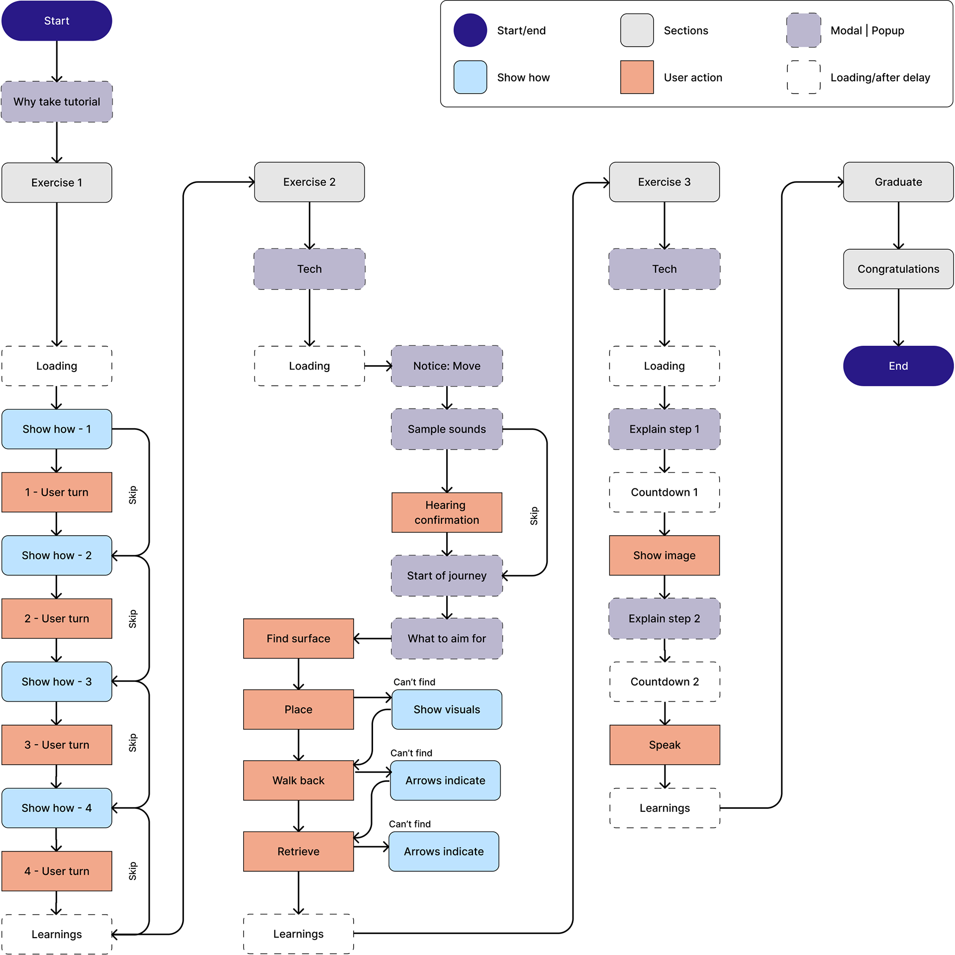
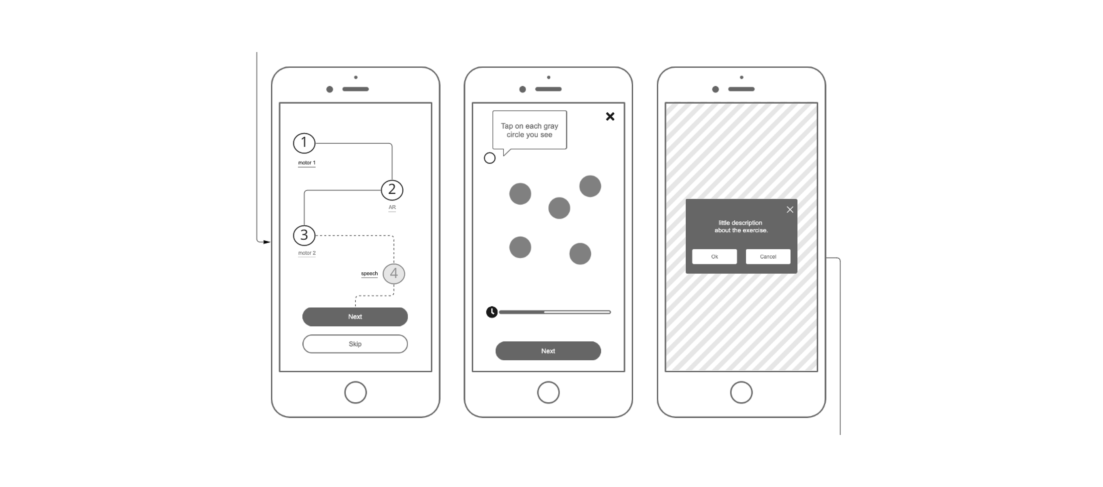
User Flow
The simplified user flow intends to minimize the visual load of activities while still addressing all aspects Adam will encounter when taking the assessment.
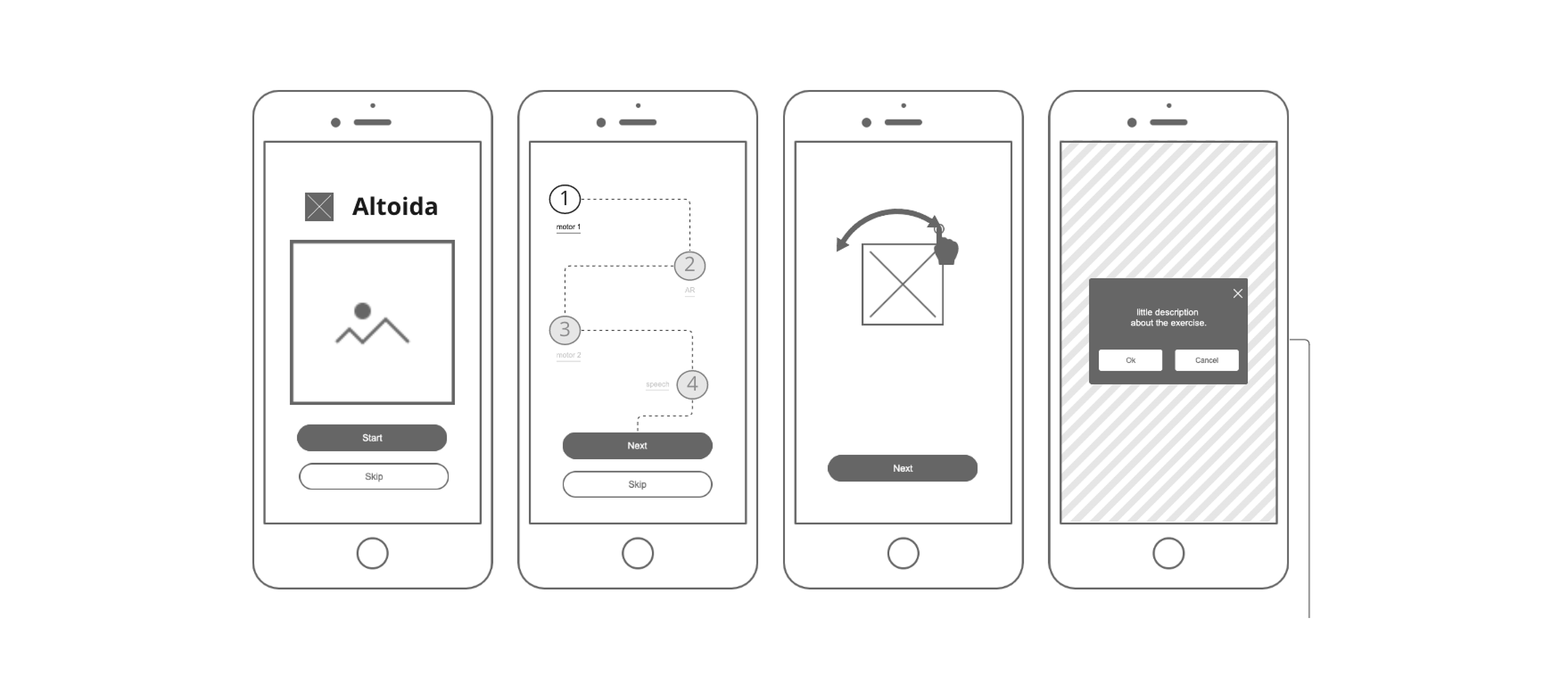
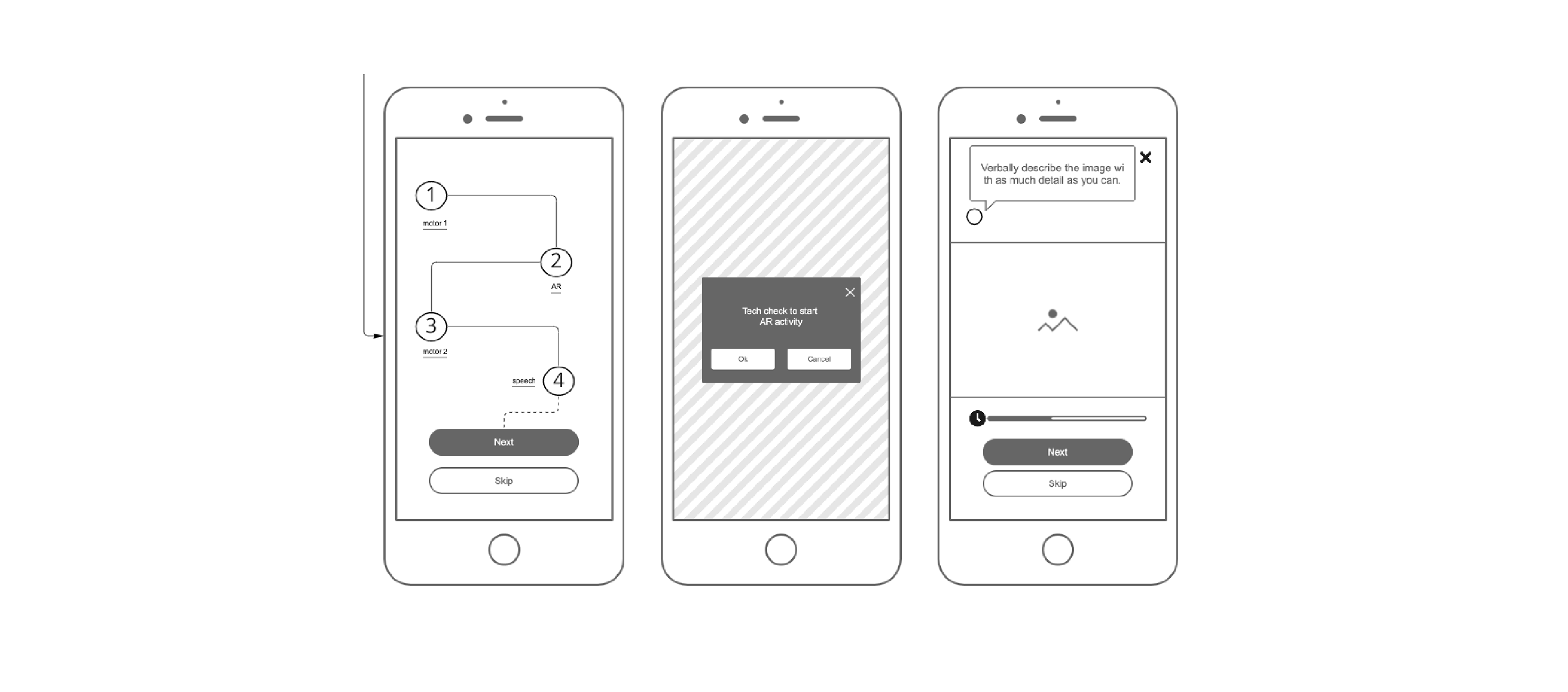
Wireframes
During the ideation phase, the goal was to lower the user's anxiety levels to ensure Altoida could get higher-quality and accurate data. The experience should feel like a fun adventure where Adam would go through the tutorial and leave with a sense of tranquility and accomplishment for taking control of his health.
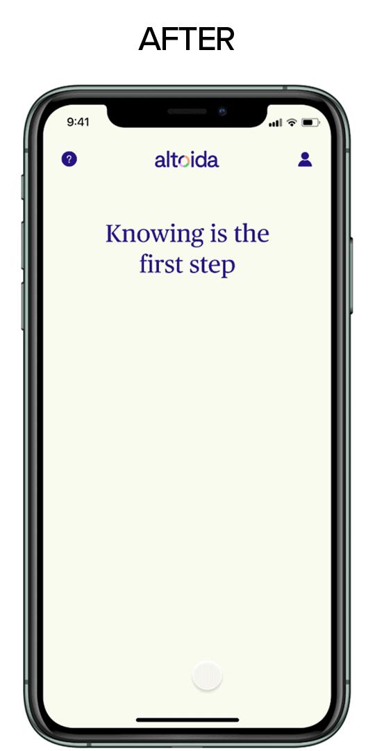
UI | Before & after
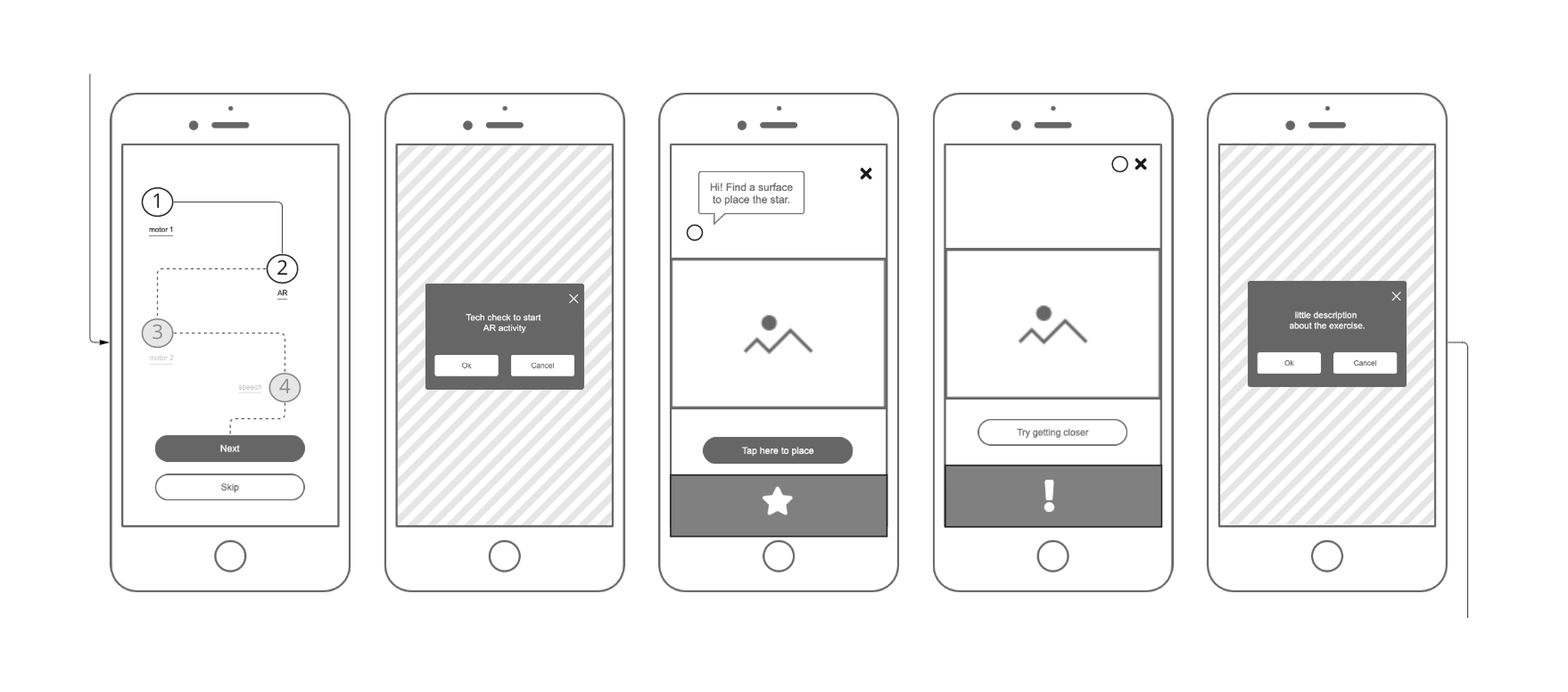
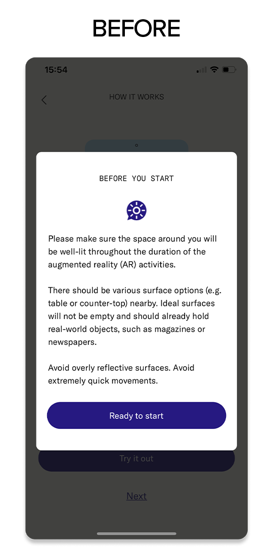
One of the first things I decided to tackle was the tutorial overview, which initially was dense and lengthy. After simplifying the flow, I opted to reinforce the value of going through each instruction so the user would feel more compelled to participate in the journey.
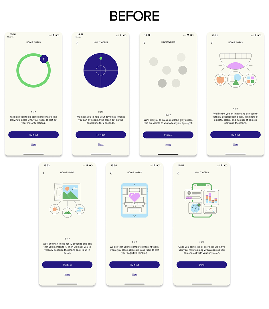
Since the goal is to make the experience fun and frictionless, visual representations would be more impactful and effective than blocks of text throughout the instructions.
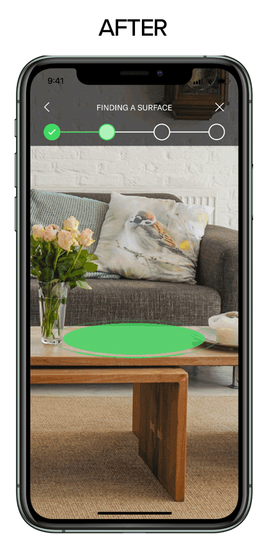
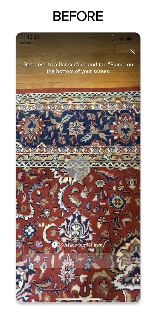
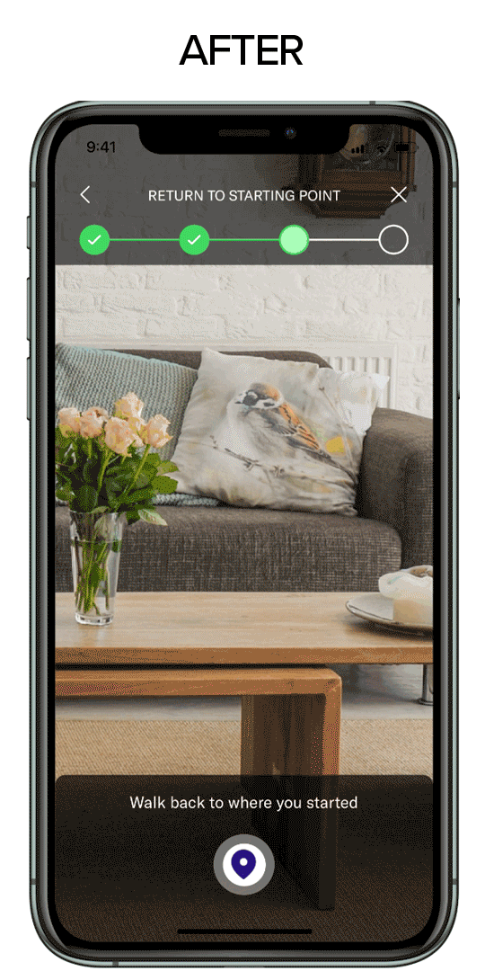
I have also prioritized help-in-context to ensure the user knows which steps to take at the time of need. That was also achieved by giving more contrast when indicating an error state and showing them a way out.
Results & prototype
AD medication in the market faster!
By using less written information and more visual queues and walking Adam through every step, he can leave with a sense of tranquility and accomplishment for taking control of his health while being reassured of early detection's importance and benefits. He can finally tell his daughter he is now on top of his game. Altoida will be able to collect more accurate data and better define demographics and candidates for clinical studies, which will help bring medication to the market faster.
Play around with the Figma prototype: