SageSure is an insurance company focusing on property coverage in 14 coastal states at a higher risk for damage caused by severe storms.
TEAM
Isabella Ramos
Jacqueline Chmura
Anastasia Zhyvitsa
Isabella Ramos
Jacqueline Chmura
Anastasia Zhyvitsa
MY ROLE
Researcher, UX & UI designer
Researcher, UX & UI designer
PLATFORMS
Project management: Notion
Designs: Balsamiq | Figma
Usability testing: Maze
Project management: Notion
Designs: Balsamiq | Figma
Usability testing: Maze
DURATION
3 Weeks
3 Weeks
THE PRODUCT
As part of CUNY cohort, our team of 3 designers held a kickoff call with the head of Design at SageSure. He gave us insights about their business and challenged us to improve their customer portal experience. After we presented our findings to a panel of judges, we were invited to show our projects to SageSure's internal design and product team.
THE CHALLENGE
During our meeting, the client told us we had the autonomy to decide on what to tackle after our research. Having an open-ended requirement is just as freeing as it is paralyzing. So, to understand the market, we had to strategize and define our approach. Our discovery process was divided into 3 phases: external research, competitive analysis, and user reviews and surveys.
RESEARCH
PHASE I - EXTERNAL RESEARCH
We decided to research the industry and see homeowners' most common pain points with their insurance companies. The majority of complaints were:
- Communication issues: Includes getting mismatched information about coverage, long hold times & not getting a callback
- Insufficient coverage: Homeowners reported not having adequate coverage, and 72% of the surveyed people were likely to shop for another insurance company
- Claims disputes: Customers complained that claims were denied for no rational reason & they received insufficient amounts for replacements
PHASE II - COMPETITIVE ANALYSIS
In comparing similar insurance companies, we noticed a few critical features that SageSure's competitors utilize to improve their customer experience.
These features include accessibility tools and the ability to customize your policy or get a quote online. Competitors also offer discounts and perks more explicitly than SageSure, making their products more appealing. At this phase, we narrowed our focus to the following:
- Policy customization
- Messaging platform
- Accessibility
- Additional languages
We analyzed: Hippo | Lemonade | AMICA | Young Alfred
Below you can also see our complete heuristic evaluation of the four direct and indirect competitors.
Below you can also see our complete heuristic evaluation of the four direct and indirect competitors.
PHASE III - USER INTERVIEWS & SURVEYS
At this phase, it is time to look inwards and see what SageSure's customers' common pain points are. Through extensive evaluation of user reviews, we found that lack of communication from the company and an inability to reach customer support due to long phone wait times were the major complaints. However, when people did reach customer support, their issues were quickly resolved, resulting in a high rate of customer satisfaction.
PROBLEM STATEMENTS & Persona
"How can we make it easier for homeowners to see what is covered by their policy so that they can make informed decisions?"
"How can we improve online interactions between users and the company to meet customers' needs better?"
...meet: Juanna!
Behaviors
- Got her current policy through an agent who recommended SageSure because of her home’s location
- Calls her agent when she has a question about her coverage.
- Pays her insurance monthly through the website
Frustrations
- Insurance coverages can be confusing, and sometimes the terms are hard to understand.
- Her agent is sometimes challenging to get a hold of, and the questions she usually has have simple answers.
- She hates using chatbots because they usually don’t understand the question she is trying to ask.
Facts
- Existing customer with SageSure
- Lives in an area with hurricanes but has luckily not had to file a claim on her property
- Doesn’t have flood insurance and is unsure if she needs it
Goals & needs
- Must have an affordable option for homeowners insurance
- Wants to understand her policy better to feel secure in her coverage
- Needs to get answers quickly to her insurance questions
- Wants to know about ways to reduce her insurance premium
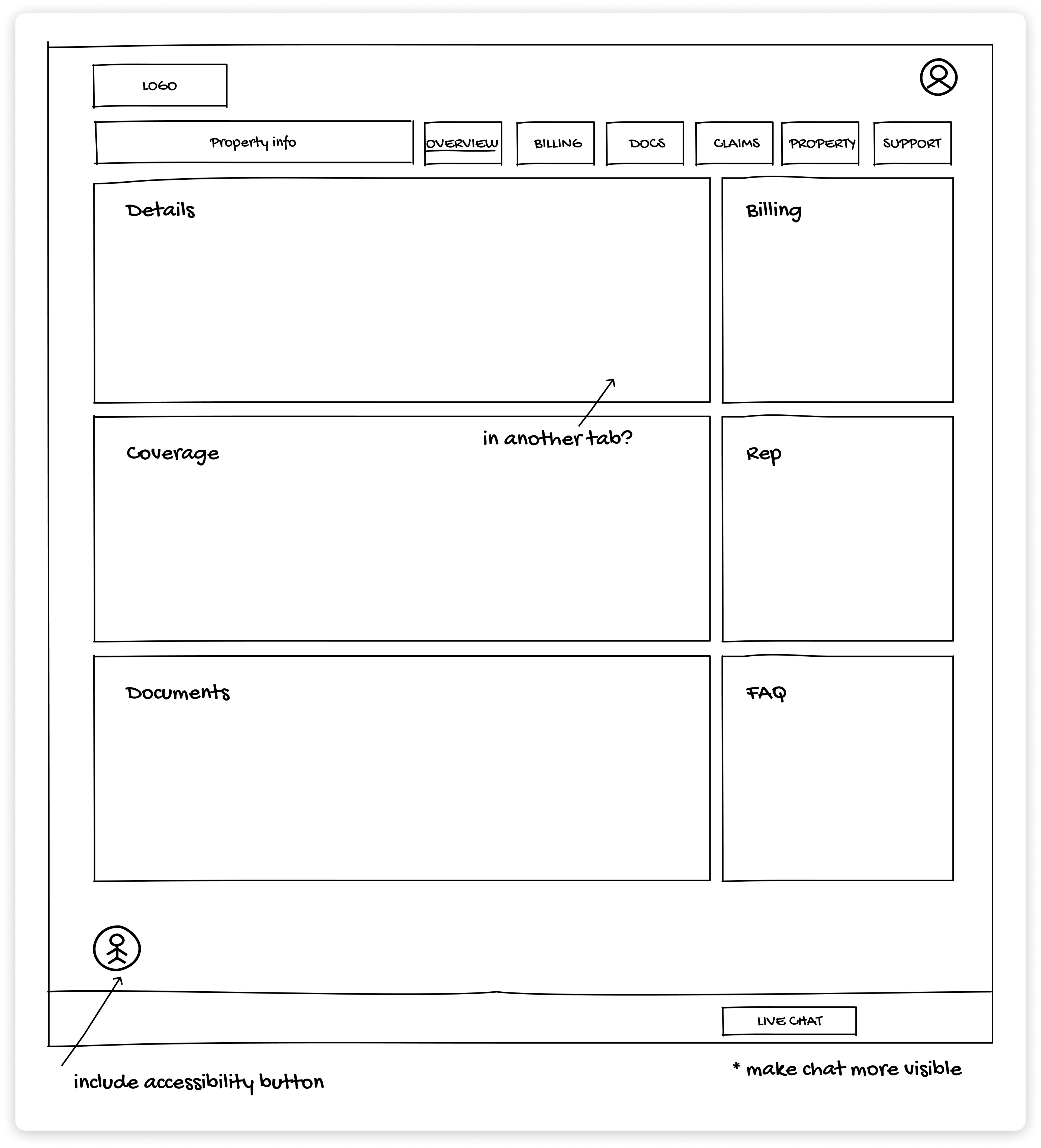
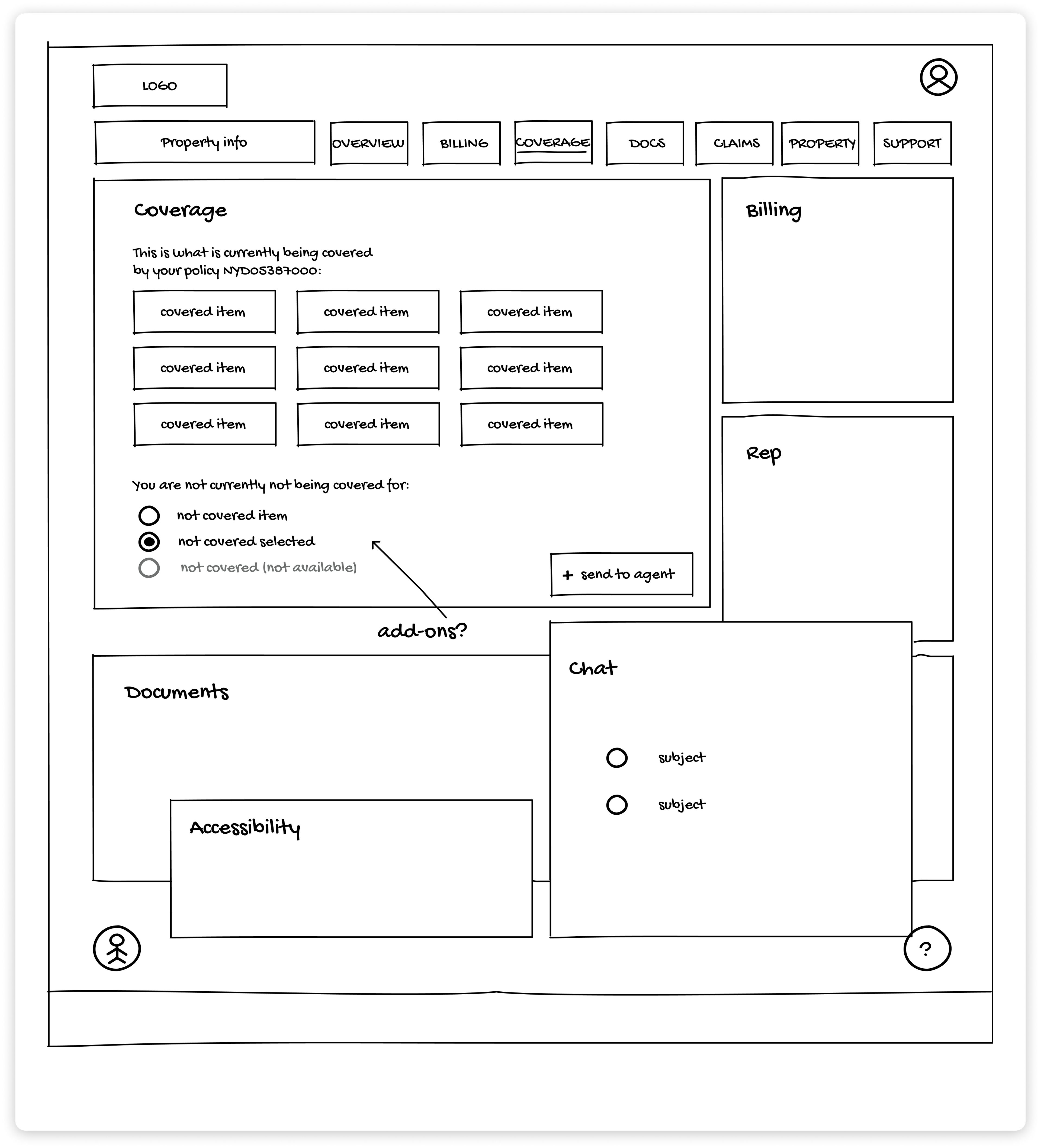
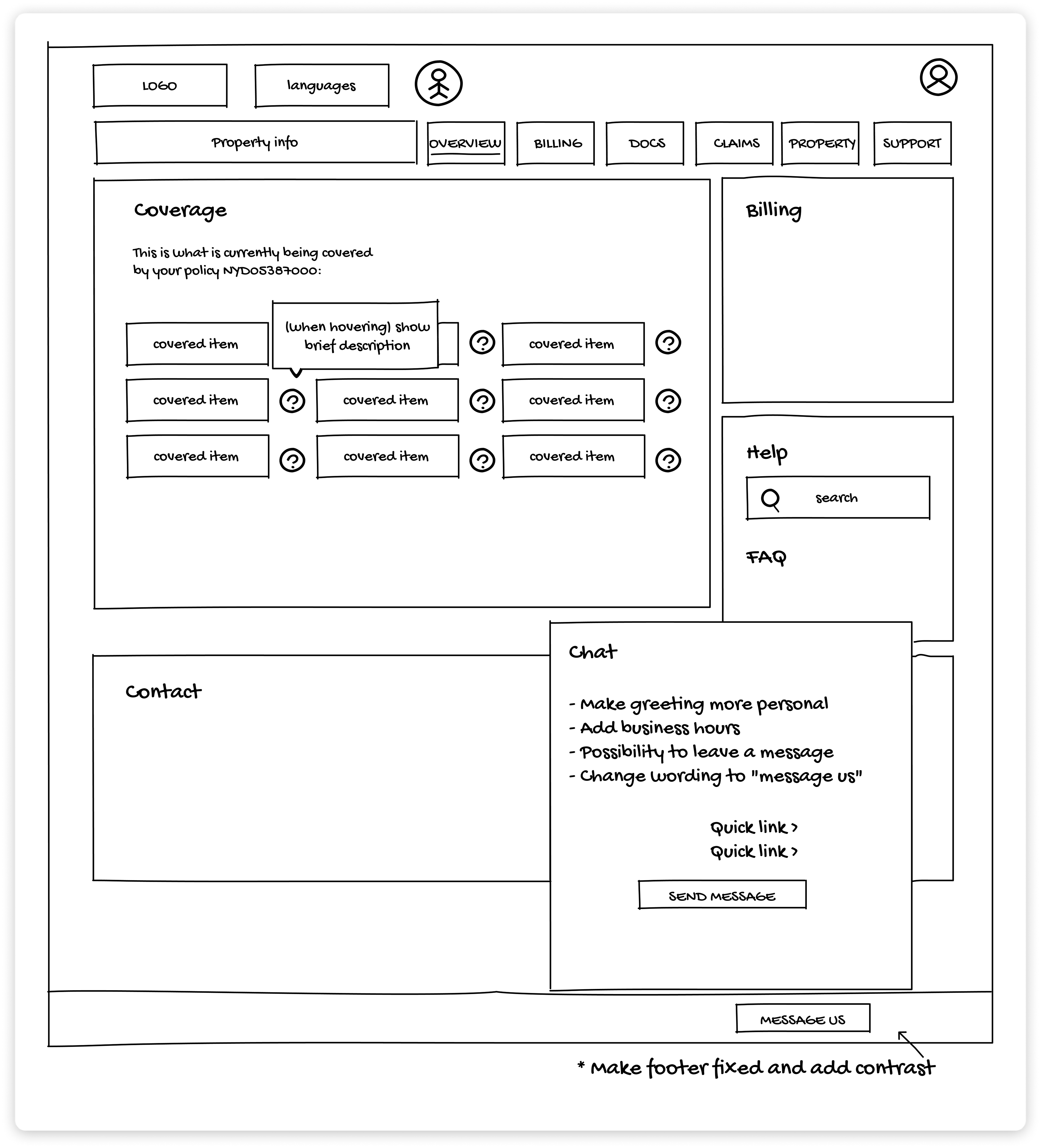
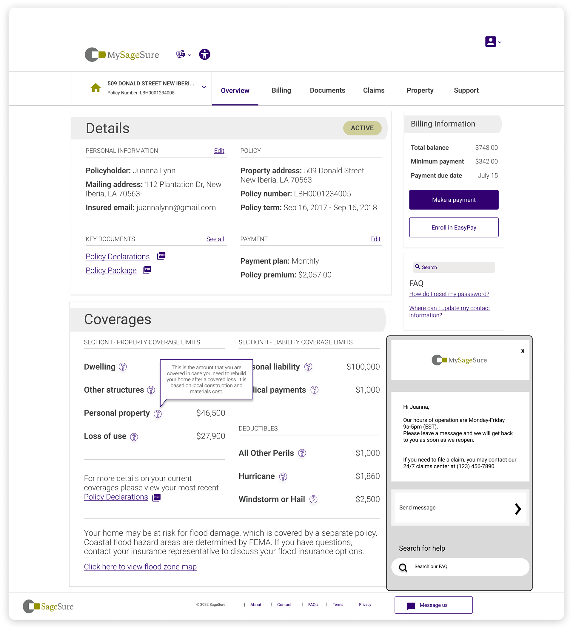
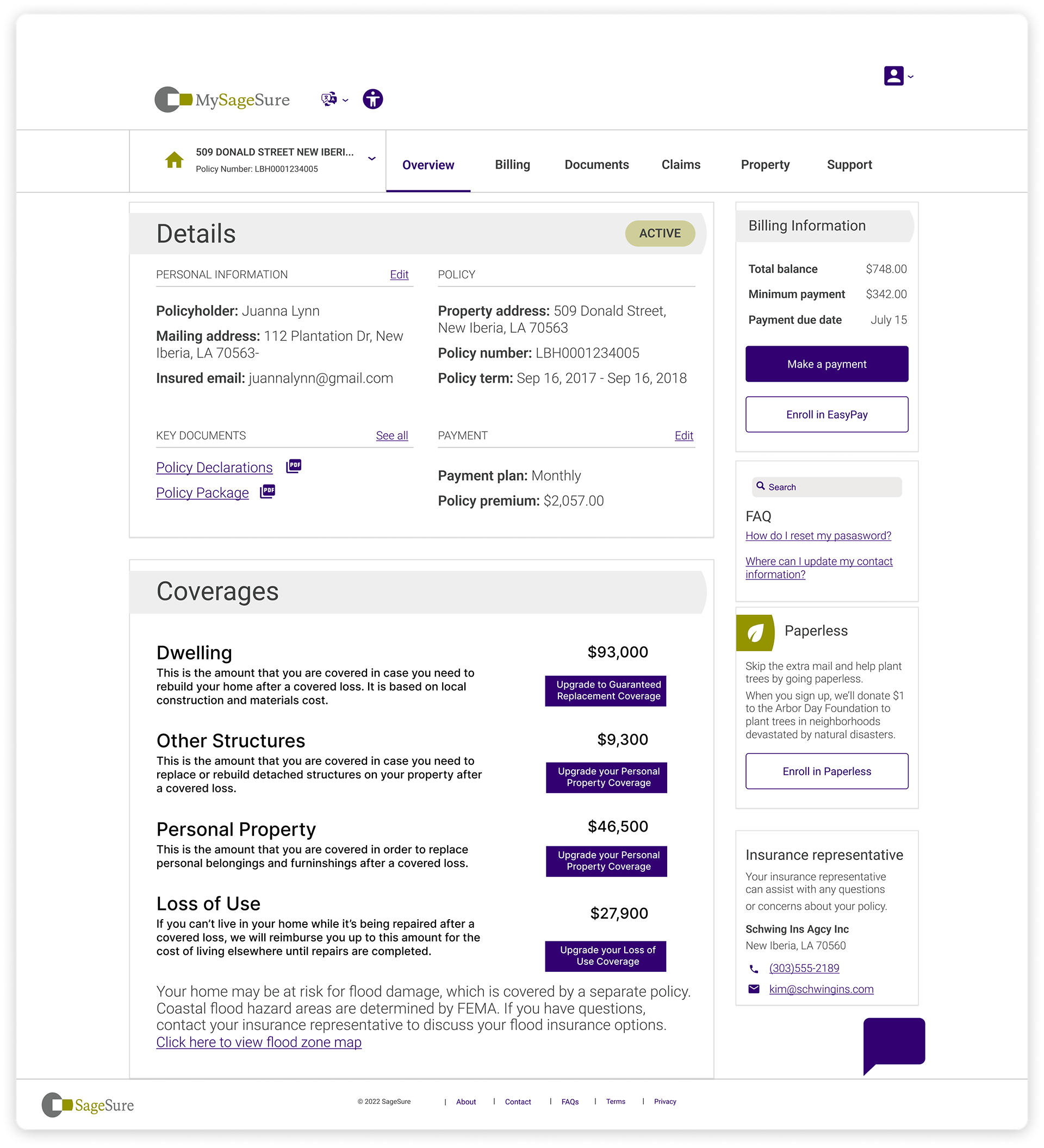
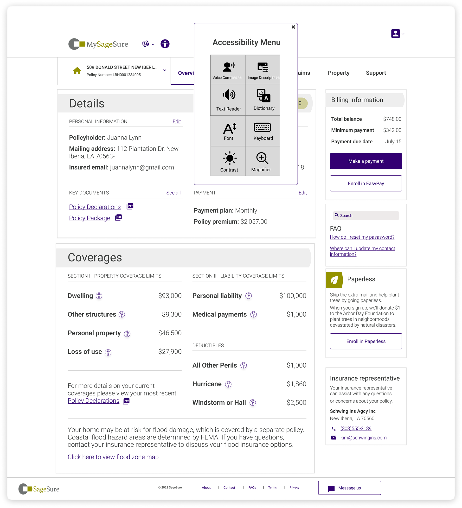
LO & HI-FI WIREFRAMES
Additions
After conducting our research, we have identified several functions that need to be added to SS' interface in order to address the problem effectively. These include:
- Accessibility Menu: We will enhance user experience by implementing an accessibility menu for universal usability.
- Callback Function: Introducing a callback function will reduce wait times and streamline communication.
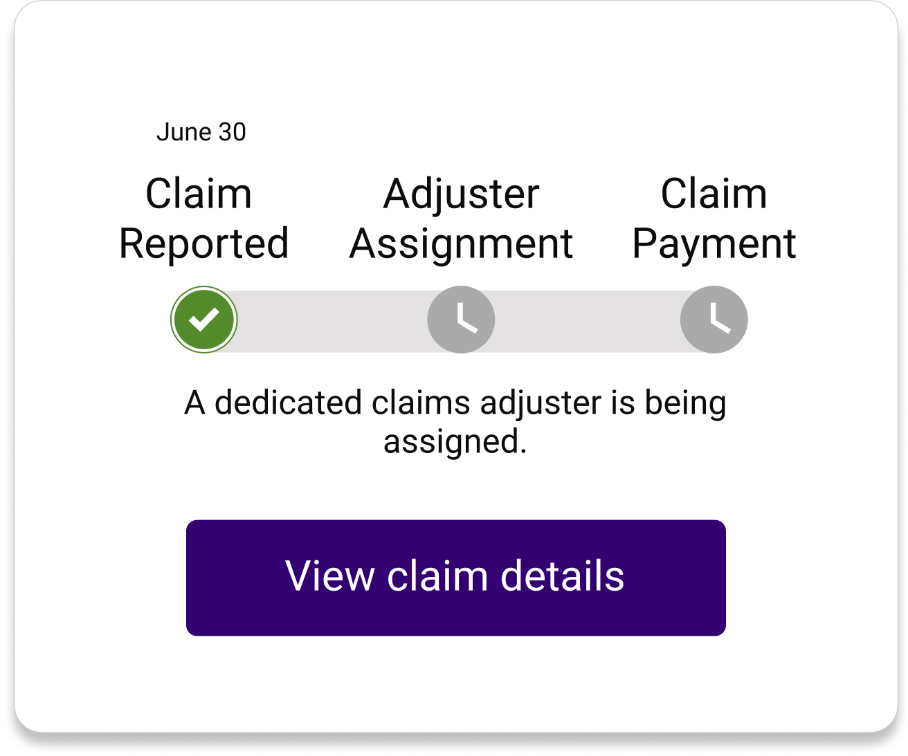
- Quick Claim Status View: Users can access a concise overview of their claim status, improving transparency and convenience.
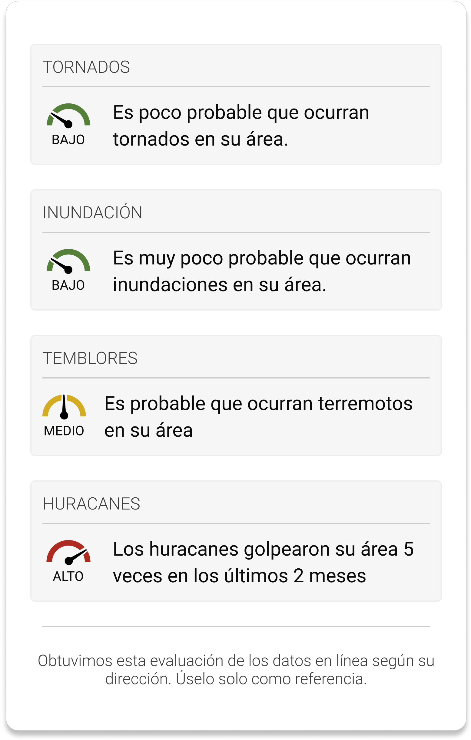
- Area Risk Assessment: Incorporating an area risk assessment feature will provide users with pertinent safety information.
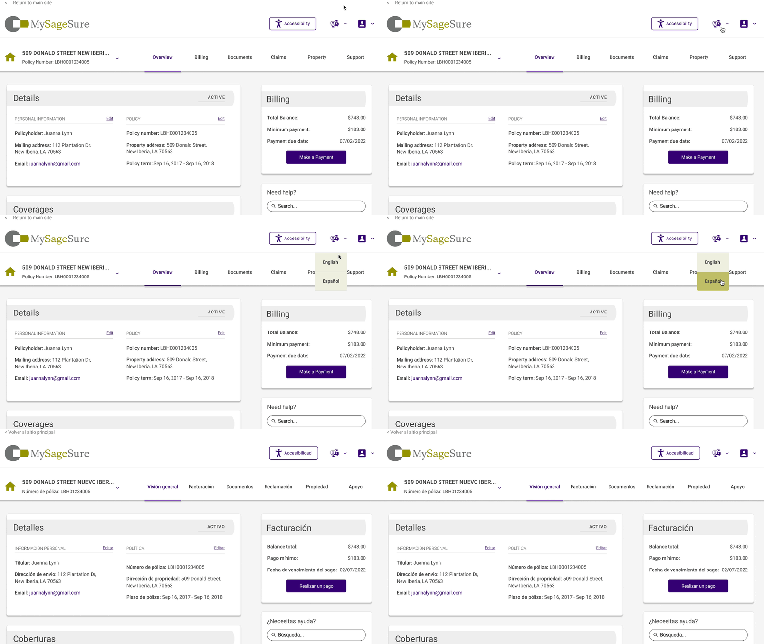
- Spanish Version: To cater to the substantial Spanish-speaking population in the covered areas, we will offer a Spanish interface version.
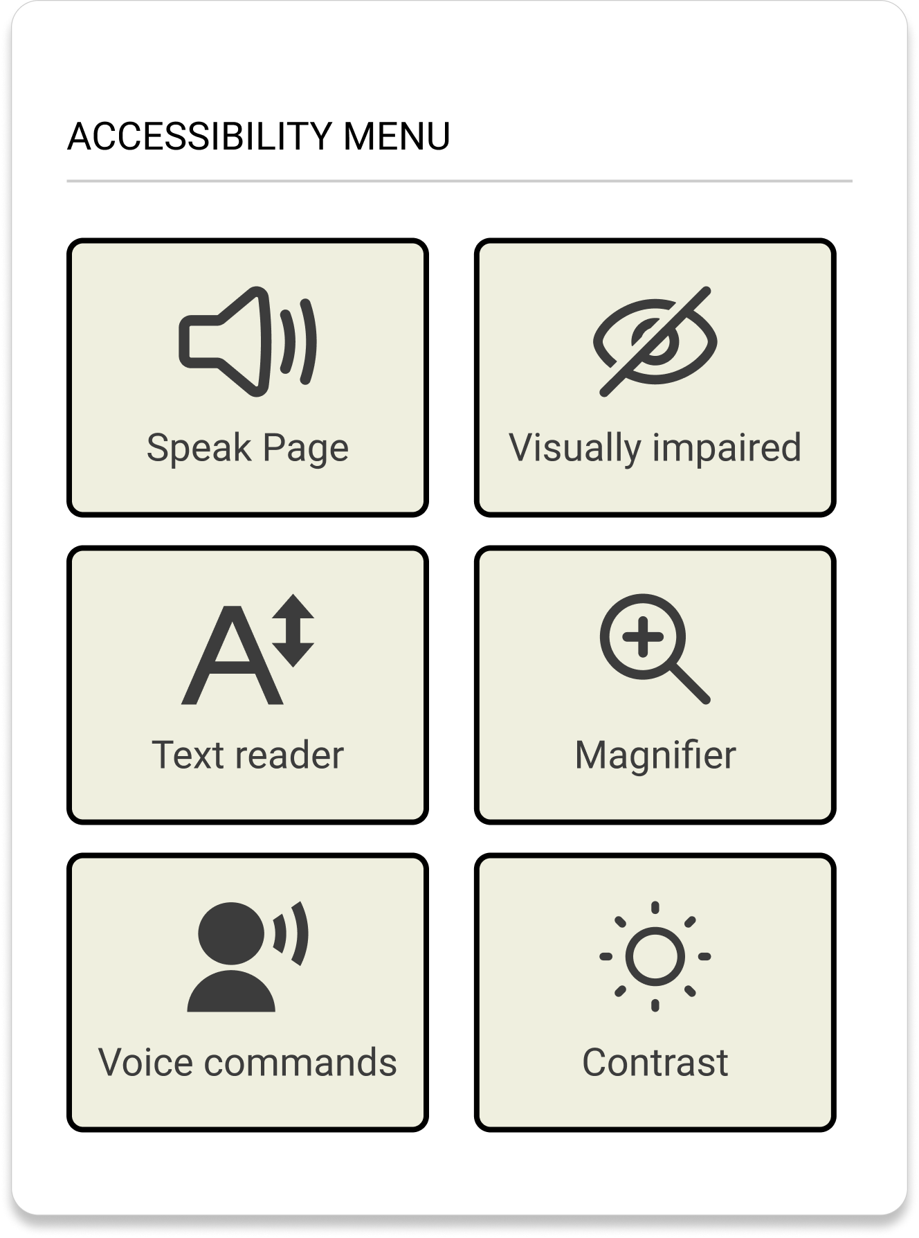
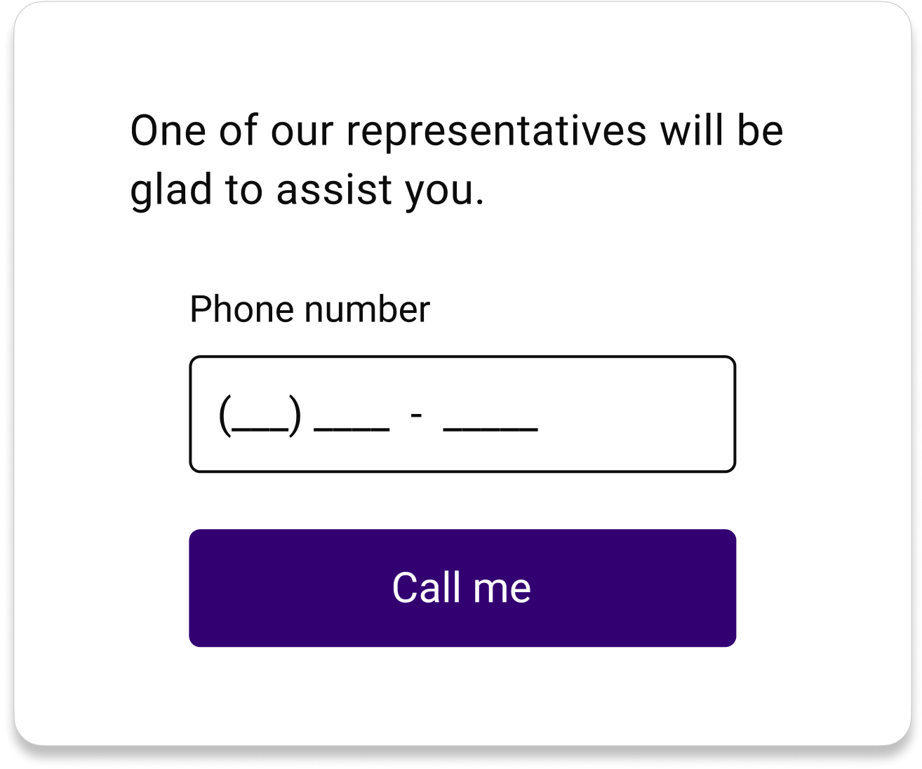
Results & prototype
Peace of mind during hurricane season!
We ran two unmonitored usability tests with 17 users via Maze.
We asked them to complete two tasks: finding out if their policy covers hurricane protection and sending a message to a customer representative. We compared both the current version and our redesign.
The direct success rate while completing the task increased from 66.7% to 88.9%, while the bounce rate dropped from 16.7% to 0%.
Play around with our Figma prototype:
